You're never too old to learn
How often do you find yourself in a situation where you feel that your travel pictures don’t do justice to all the fantastic things you saw and experienced?
Then you should read these guidelines on how to take amazing travel photos!
All it takes is patience and the will never to stop learning; you can always improve your photo techniques.
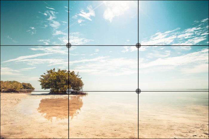
Rule of Thirds in photography
It is an excellent idea to become familiar with the rule of thirds. The technique entails having your main focal point within one of the crosses.
- All you have to do is break your image down into nine equal-sized rectangles, three horizontally and three vertically – what you then should do is place your focus object at one of the four intersections.
Today most digital cameras (even smartphones) have the functionality to activate a grid, just like shown down below; it will help you a great deal with setting up the composition easier!
Don’t always use the rules of-thirds!
Sometimes, it’s necessary to completely counteract the rule-of-thirds by having your main object in the center of the image instead… Putting the motive in the center is something I mostly do when I photograph portraits etc.
- My best advice is that it’s important to remember that this does not count for everything; sometimes, you have to be creative and do entirely different compositions.
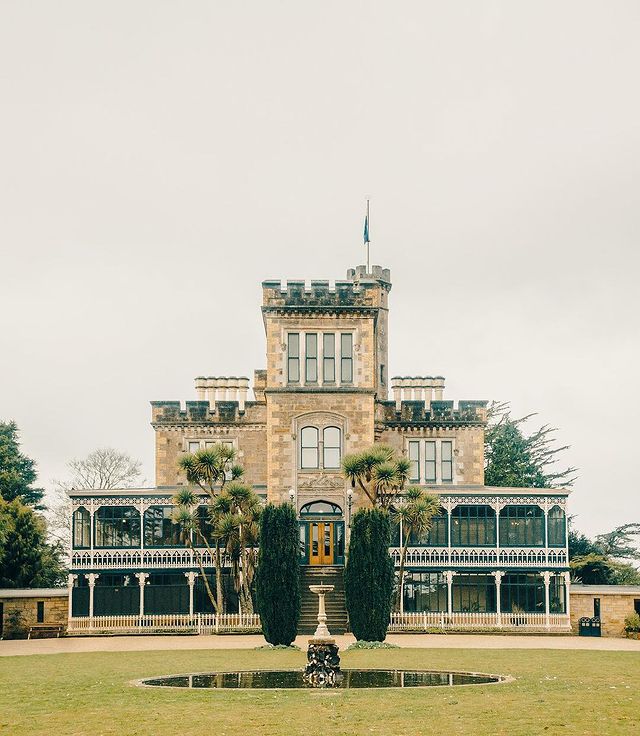
Symmetry
The most important thing for shooting great photography is all about creating a well-balanced image.
You can balance your photographs using one of the many composition methods;
- One method is to be using the rule-of-third like we just talked about,
- Another way to achieve this is by using symmetry in your photos.
Having an imbalanced image is most often not a good thing at all for your image, and this could, for example, be to avoid having too many dark tones on one side, which will prevent the image from ’tilting.’ Again, this does not always count, but it is a good starting point. A good symmetry can, for example, almost bring the picture to life.
The only time you would want to have an imbalanced image is most often if you intentionally want to add an element of chaos or disorder and artistically use that.
Personally, I never worked much with the chaotic element like this; I am mainly about creating harmony in my image compositions.
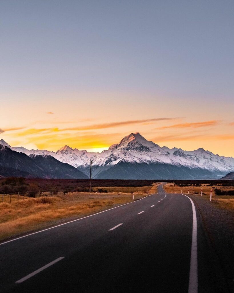
Leading lines
Leading lines can be powerful for forcing the eye in the direction of what is relevant—for example, a road leading to a tree or a mountain.
- Utilizing leading lines in your photos is another great way to establish a balance and a harmonic expression.
It’s always a very cool idea to photograph roads, tracks, or anything similar leading towards the horizon line; this will create a remarkable effect of depth, which is super pleasing to the viewer.
- The horizon line is where the fore- /middle-ground meets the background, and this horizon line is an essential element in many scenes.
Using leading lines to apply movement in the photo
Leading lines can also be used to make the eye look away from an object and create the mood of being in a rush.
Below, I used the lines to make the audience feel the movement within the picture intentionally.
The curvy lines in the ceiling here adds some intensity and underline that the person in the photo is walking hurriedly in the same direction.

The reading direction
In photography, balancing the composition is essential, and It’s always a good idea to consider following the reading direction, but what does that mean?
Humans are taught to read from the top left to the bottom right in almost all cultures: If you imagine reading a page in a book, you start in the top-left corner and read to the last word in the bottom-right corner.
You can utilize this if you cannot establish balance through either rule-of-thirds, symmetry, or framing the object like I describe how to do in this article …
Create a balanced image by taking the viewer’s attention from the top-left corner and onwards to the bottom-right corner. By doing one of the following things (sometimes you can apply multiple principles, but sometimes just one will do):
- Placing a heavier object in the bottom right area of the image, to make it heavier on the right side (this will always make the viewer finish his “Read” on the heavier object).
2. If you have a moving object, then compose the image so that your object moves towards the right or bottom-right side of the photograph.
You don’t have to follow this rule always, but its generally a great rule.
3. Locate a thing/object where you can lead the line from the top-left to the bottom-right.
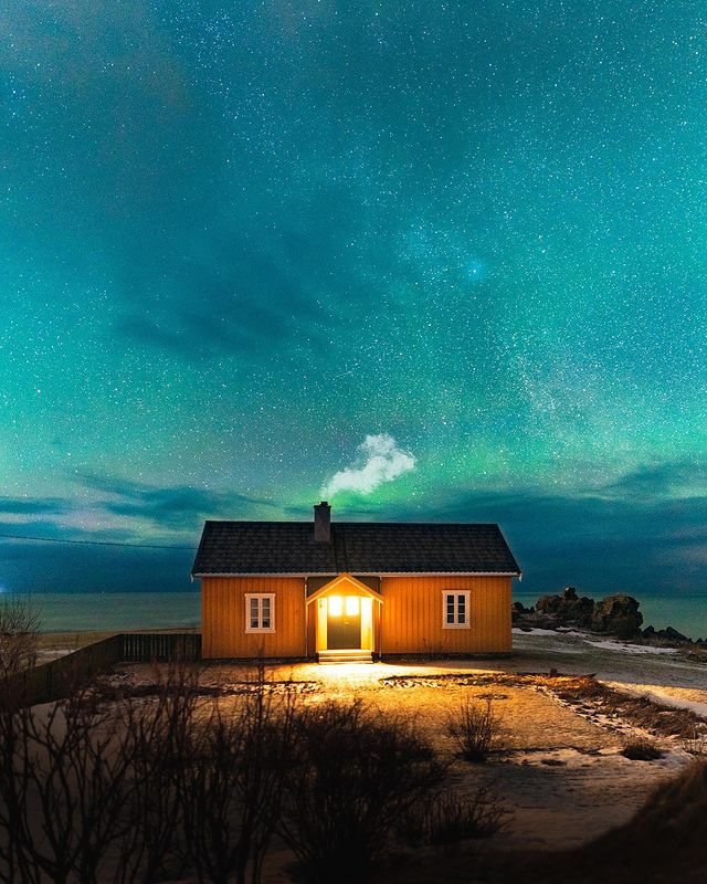
How to use complimentay colors
Playing with colors can bring something very strong to a photo, especially if you focus on using a lot of contrast, by using opposite colors, also known as complementary colors.
For example by shooting a picture of a yellow house in an otherwise very blue photo:
Framing the object
A good rule of thumb when framing your picture is to have your objects consist of an object taking up 1/3 of the space while the last 2/3 parts of the image is dedicated to landscape, sky, or something like that – This is a good method to keep in mind, and it helps create balance in the photo.
- If it becomes 1/2 part sky 1/2 part landscape, it most often can cause a disturbance in the balance and be hard for the viewer to know where to focus their eyes if everything is given equal spacing.
Here in this example below, I used 2/3 sky and 1/3 landscape. In this case, the object I focused on was the landscape, and you might think having that as the primary element is unusual when it only takes up 1/3 of the image.
But using this framing principle correctly will make your object stand out much more and be more pleasant for the audience to look at.
- Don’t be afraid that the object is too small when it’s only given 1/3 parts of the photograph.
How to make proper use of color theory
Some colors compliment each other better than others.
If you want to master the art of using colors, you should get familiar with complimentary colors. Complimentary colors are as the name suggests, colors that complement each other very well. This means they work well together and make each other stand out.
But what colors compliment each other better?
The easiest way to begin working with complementary colors is by learning the opposite colors of the simple colors: Yellow, Purple, Blue, Orange, Red, and green.
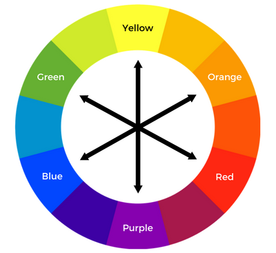
Here are the three most traditional pairs of complementary colors: Yellow and Purple Blue and Orange Red and Green
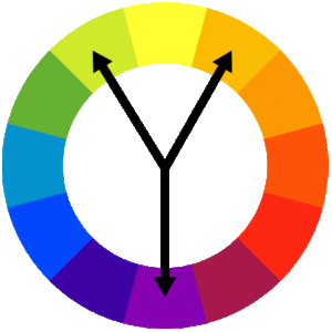
Split complementary colors
When you then work with more color tints, you will realize that there are multiple solutions for using the principles of complementary colors that will give the same output and result to some extent.
- If you’re photographing something that’s Purple, you would immediately be looking for pairing it with something yellow, right
Because that is, in theory, the best contrast you can create, but what you quite often will realize when going around shooting photos, at least in nature, etc. is that you cannot always find the perfect contrast-colored object to photograph.
So it would help if you were also on the lookout for the next-best color contrast for Purple, which is bright-orange or bright-green.
- Using bright-orange or bright-green instead of yellow, together with the Purple, is called using a split complementary color, and the principles for using this theory are displayed below.
Change Your Perspective
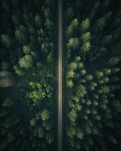
The best photos are not always taken in normal standing perspective; they can also be taken lying down, zooming in on a grass stroke, or from the sky using a drone and pointing the camera downwards.
There are no rules for how the perfect shoot should be taken; it is all about channeling your creativity and see what works for you!
A good rule of thumb is to also think about “Using the surroundings to create depth” when you’re in the process of thinking about what’s the right perspective for your photography.
Using the surroundings to create depth
You have probably heard of Depth of Field (DOF), which is the depth within a photo.
It is a way of imitating a 3D effect within the picture and creating different layers.
- For example: down below is an image where I use some blurred-out leaves to make the image look more realistic, as if you were there yourself, looking through the threes. Here I also chose to use the blurred-out leaves since they make the audience focus on the leaves lying on the ground giving this image an astonishing autumn mood scenography.
")
This technique is a gamechanger
Using this technique can be a gamechanger for shooting even more marvelous photos than you’ve ever done before!
- So how do you approach this, and create depth in your photos?
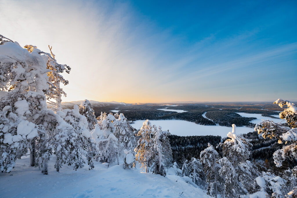
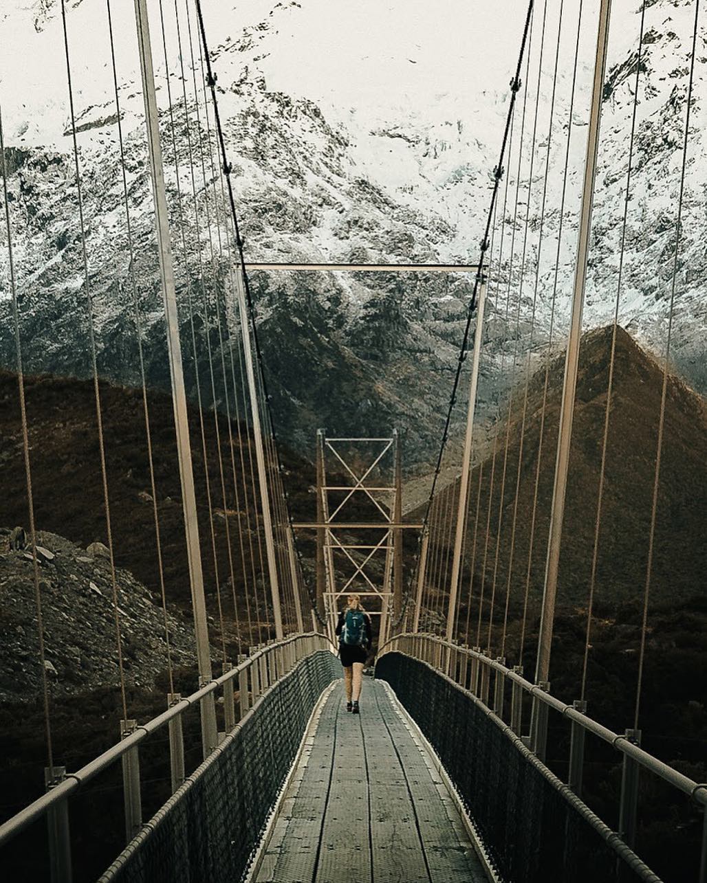
First, you should be aware of adding at least three layers to your images, as often as you can. The three layers you should focus on are the fore-, middle- and background of an image.
Sometimes you can even apply multiple middle-ground layers to add even more layers of depth to an image, just like I have in the image here below.
- The grass is blurred in the foreground, the hiker is in the middle-ground, the lake also in the middle-ground, and the mountains are in the background.

My advice is to use what’s natural!
I always find it essential to think about the elements that have a natural connection to my shooting perspective, mainly when I shoot landscape photographs.
So when I am photographing something from a frog perspective close to the ground, I consider using elements that would naturally be placed near the ground as a foreground element.
- Here zooming in on a grass stroke, a rock, bush, or something like that, would be brilliant! Just like in the example below

Another exemplary scenario could be taking a photo from higher up in the treeline and using branches in the foreground to create depth, just like in my shoot from Italy in the example here below.
- The individual branches here are in the foreground, the house in the water is the middle ground, and the mountains and trees make up the background.

Add focus by using blur
It may sound a bit weird, but blurring elements inside your image, especially in the fore- and the background, will help the viewer experience quite a lot of scenography setups.
Blurring objects or entire layers of the image makes it even more apparent what the viewer should focus on because the eye is naturally looking for sharp elements. So you can use this to control the audience’s attention.

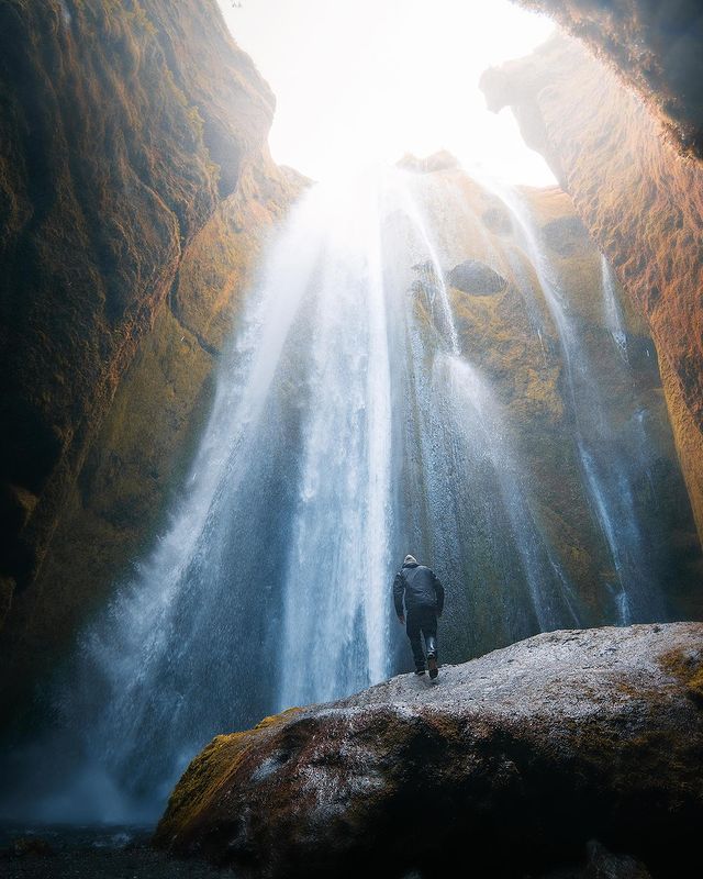
Get Close or Step Back
Similar to choosing your perspective, there is a big difference in whether you are standing close to your object or far away and zooming in.
In some cases, it can be ideal to come up close like here:

Try to walk a few steps back!
I often see people zoom in on their object, but I will encourage you to try and walk a few steps back and photograph the entire scenery.
In other cases, it can be even cooler if you step back a little, just like here:

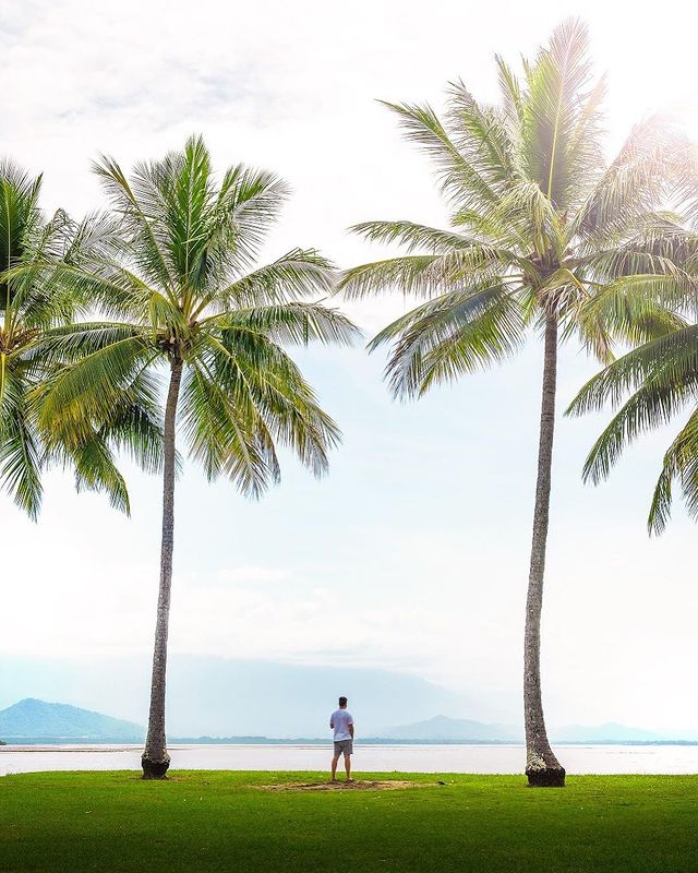
Play With scale and proportions
In some cases, it can be hard to tell how big a mountain is or how tall trees are in a nature photograph.
An intelligent way of helping the viewers of the image is by adding an object to the picture that gives the audience a little bit of context into the proportions of everything.
- Applying this element of visualizing the scale helps the perceiver’s eye, and it also implements a sense of longing to be there yourself.

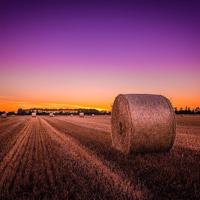
Adapt to all weather conditions
Who wants to take photos on a grey day?
Sometimes it can prove to be an advantage when conditions don’t turn out as planned. For example here – a grey day, but it sets a calm and serene mood with the grey clouds and wind in the straws.

All weather is great for photography!
Don’t be afraid of a little rain or cloudy weather!
- Instead of feeling limited, you should learn to master to shoot great photos no matter the weather conditions.
You should get creative and think outside the box when the weather conditions are less than ideal!
Everyone can photograph amazing images on a sunny day. However, only the most skilled photographers can readjust to all circumstances and knows how to see the benefits of “bad weather” or low-light.
There is potential of all weather conditions;
- Low-light or night photography: takes patience and planning, but it has some great potential if you can implement a light object into the photo; I always travel with a flashlight in my back, and that has come in very handy!
- Rain, Snow, and wind: are outstanding elements to create an intense photograph with an action-packed mood.
- Cloudy weather: is often the ideal photo setting for shoots, where you would like to put a lot of effort into the post-edit session, because here no colors are getting burned out, and you’re left with so many opportunities as an artist.
- A sunny setting: is always ideal for shooting photos with a warm atmosphere; it can sometimes be hard to master, though, if this warm result isn’t what you’re going for!
Try to work with all conditions and find your way to capture great photos anywhere, anytime!
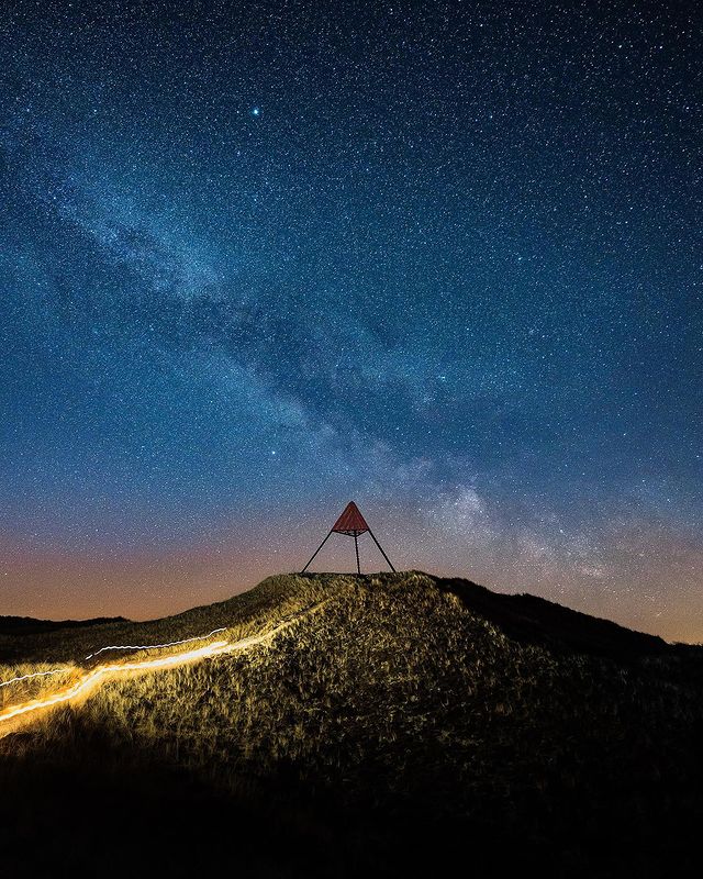
Lighting
You have probably heard of Golden Hour, Blue Hour and Twilight.
It is essentially just different times of the day where the light changes. Especially golden hour, is any photographers dream. Here the light is soft and warm, and it gives some fantastic colours and shadows.

Look for reflections
Reflections are everywhere. You just have to look and pay attention to your surroundings and know what you’re looking after! Reflections can genuinely make your picture stand out and apply some “Wow-factor” to your photos if you compose it right!
- Sometimes, the reflection can even create breathtaking illusions.
I always find it entertaining to be on the lookout for utilizing reflections to create a unique photo composition with a more artistic expression.
So what reflection elements should you look for?
Here are a few elements to be on the lookout for when you want to use creative reflections in your travel photographs:
- Rivers, Canals, and Lakes: are great for reflections, primarily when it’s not windy, and you can almost see a mirrored world in the water.
- Puddles: can also help you produce amazing reflections if there is no wind or rain.
- Shiny objects: like dark-colored cars or dark blank objects, can be terrific for creating reflections.
- Windows and glass: are always good alternatives, but not something I personally have used as much when I’m out shooting photos.
Summary
So these are my technique to get some stunning photos!
- Did you have a favorite tips & trick?
Let me know if this could help in any way.
Feel free to contact me on Instagram and follow my work there as well.
Thanks for reading
Thank you so much for reading this article.